This article may help product managers, developers and junior designers learn basic usability rules and recognise common design mistakes.
Designing with a user in mind
Create a goal-oriented design
An aesthetically pleasing design has no value if it doesn't help a user achieve their goal. While creating your website, you should keep in mind that a user has a task to complete. There shouldn't be random meaningless features. Only those that help in completing such tasks should be included. Thus, you should avoid adding features just because you may have seen them on some competitors' sites. It is best to think about whether they are really needed.
In other words, any functionality appearing on a webpage should have a purpose. Otherwise, it just increases the cost of development.
Although the design should primarily solve user problems, do not give up on making attractive layouts. People tend to be more tolerant of minor usability limitations if the site looks nice.
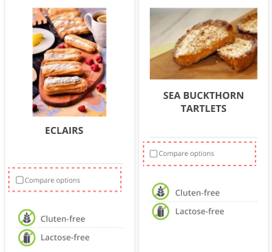
The ‘Compare Options’ feature is more appropriate for websites selling complex products, like gadgets, when there are options to compare, such as screen resolution, memory and so on. In this case, the feature may consume time on development while not increasing usability.
Place the most relevant information above the fold
If the site doesn't look relevant to users' requests, they will most likely abandon it. This is why you should reserve the top of the page for high-priority content.
The term ‘above the fold’ comes from the physical world when people used to fold a newspaper while reading it. On the web, the ‘fold’ refers to the visible area of the page on the screen that doesn't require scrolling.
If the content above the fold is confusing or insufficient, we will not scroll down the page in the hopes that there is something useful a few screens below. We'll just close the tab. Therefore, the content placed above the fold should motivate a user to stay and discover more.
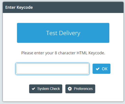
This example is from a Nielsen Norman Group article showing a lack of hints on what this site is about.
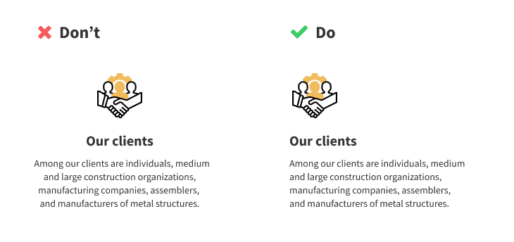
Make sure your website's content is unique
Trivial ‘marketese’ and generic stock photos lower a user's interest, so it's best to put authentic content on a website.
For instance, a store cooperating with eco-farmers should represent them on its webpage. Instead of placing generic photos and unsupported statements, it's better to show the farmers' faces and tell their stories, so people will feel more connected.
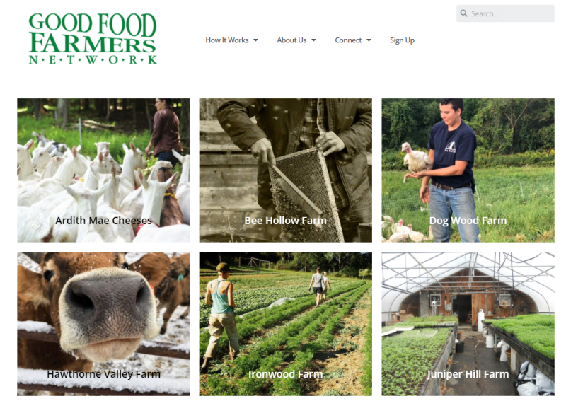
Goodfoodfarmers.com not only claim they sell responsible farming products, but they also support their statements with actual farmers' stories that build trust.
Use informative headings to promote effective scanning
People don't read text on a webpage. Instead, they scan it. Their experience has taught them that scanning is just as effective with less effort.
To engage users in learning from a page, it is best to use distinct descriptive headings that promote the ‘layered cake’ scanning pattern. This scanning technique describes the behaviour of fixating on the page headings and only reading what's most relevant to one's needs.
Conversely, if a layout doesn't emphasise the most important information, a user may miss it and ultimately leave the site.
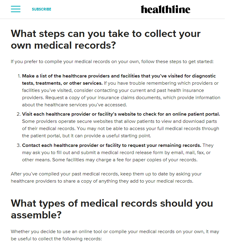
Healthline.com uses bold headers along with bulleted lists, which makes article scanning very convenient.
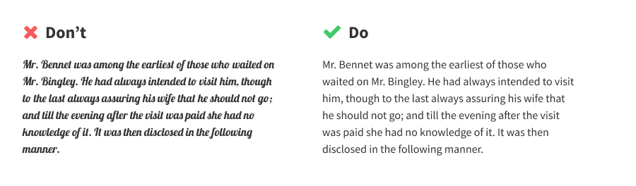
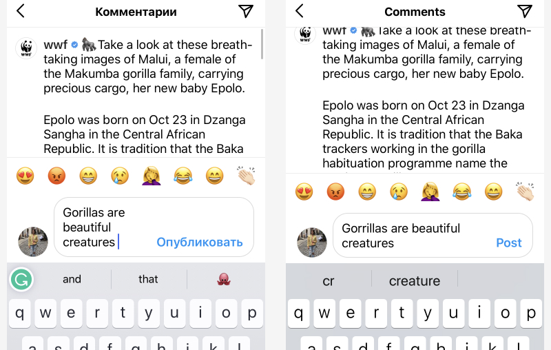
When writing for the web, be clear and concise
Avoid ‘marketese’ and promotional writing styles. In such cases, a user must filter out overstatements from what she thinks is true, which increases the cognitive burden.
Nilsen Norman Group, the leader in usability studies, researched how users read on the web. They wrote a control promotional piece of text and a few improved ones, and then tested them among a group of participants. As a result, a concise paragraph with objective language and a scannable layout improved usability up to 124% compared to the control version. This proves that users don't like the promotional writing style. People are too busy to read long texts and prefer to be given straight facts.

The paragraph on the left, written in a promotional style, is difficult to scan. Conversely, the concise paragraph on the right is easy to read and understand.
To make text easy to scan, use the following:
- Useful descriptive headers.
- One idea per paragraph.
- Bulleted lists.
- Bold keywords.
- Inverted pyramid writing style beginning with the clearest and shortest statements of your topic.
- Language that is easily understandable by a person with an eighth-grade reading level.
Visual hierarchy
Support an eye flow by setting a visual hierarchy
The correct arrangement of elements on a webpage makes it easy for a user to move through the content. In other words, setting a good element hierarchy supports eye flow. Visual hierarchy defines what a user sees first and how the eye is led further, making it easy to scan a layout. Conversely, chaotic element placement makes an eye race around the page.
The best way to set the visual hierarchy is by using white space, also called negative space, referring to the empty areas between objects. White space doesn't necessarily mean a white screen. It can also be a coloured area or a pattern that doesn't take attention away from the main objects, whether they include a paragraph of text or a picture.
In general, you should aim for your interfaces to be airy and spacious. A breathing layout creates a sense of freedom, while cluttered layouts create a feeling of limited space.
If a user needs to interact with large pieces of information, it's better to use dense layouts. This way, the screen will fit more content, so the information will be easier to scan and compare.
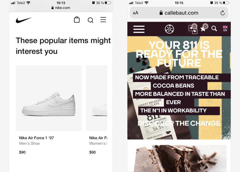
The Nike website has a lot of white space. The interface looks airy and minimalistic. In contrast, the Callebaut webpage looks more cluttered, and the text loses legibility.
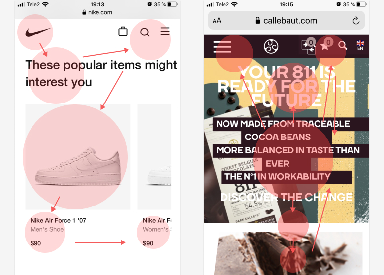
The composition in the first screenshot leads the eye from the page title to the 'Show All' option, and then to the large photo and its description. In the second example, the element arrangement is chaotic, so the eye races around the page.
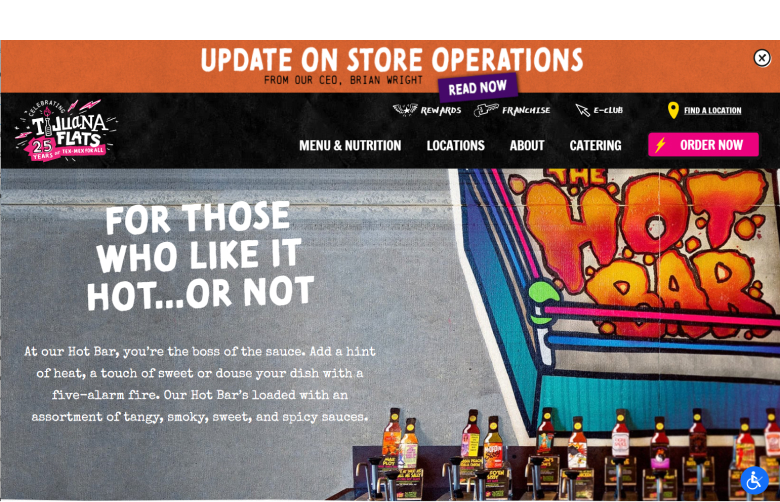
On the tijuanaflats.com website, the texture of a grey wall works as white space.
Use Gestalt rules to define relationships between elements
Good element grouping helps users understand the relationships between the elements, thus easing with scanning.
At the beginning of the 20th century, Gestalt psychologists were trying to figure out how people visually perceive the world, and how they decide whether an element is a part of a group.
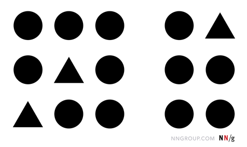
Some discovered Gestalt principles, such as Proximity, Similarity, Closure and Common Region, and these are often used in visual interfaces. The Laws of Proximity and Common Region help to set a hierarchy by separating elements into groups.
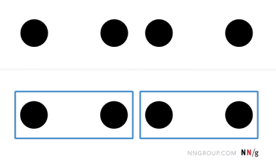
The Law of Proximity. Objects that are near or proximate to each other tend to be perceived as a group. Element grouping, or chunking, helps with information scanning. For example, it is easier to memorise three groups of two-digit items like 23-56-12 than one item consisting of six digits like 235612. To remember the last number, you would probably break it into two chunks: 235-612.
White space divides the shapes into two distinct groups. Examples from Nielsen Norman Group.
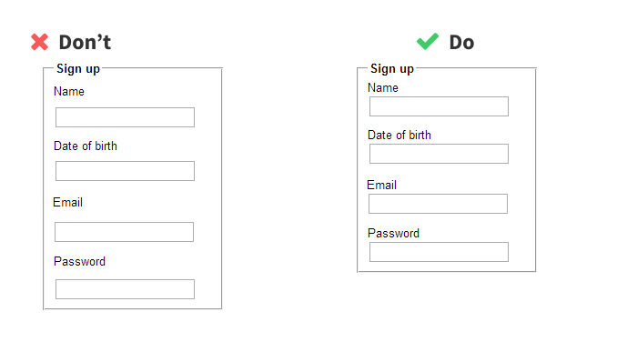
On the left screenshot, it is more difficult to tell whether the email label belongs to the top or bottom text field. On the right, the label is placed closer to its related field, so they form a single group that is easy to scan (Nielsen Norman Group).
The Law of Common Region. Elements tend to be perceived in groups if they share an area with a clearly defined boundary.
The Law of Common Region overpowers the Law of Proximity (Nielsen Norman Group).
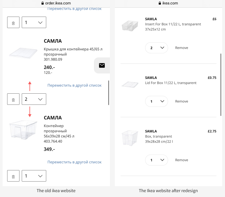
On the old version of the Ikea website, it was difficult to tell where the quantity control belonged. The new version has dividers and well-grouped elements.
The Law of Proximity is a preferable way to set a hierarchy. Elements that are part of the same group can be placed close to one another. Similarly, white space can be used to separate different groups. However, in cases where there's not enough space to set proper margins, the Law of Common Region should be applied.
Consistency and predictability
Avoid using elements in an unexpected way
According to Jacob Nilsen's Law, users spend most of their time on other sites. This means that people prefer your site to work the same way as any other sites they have already seen.
That being said, you should use controls, icons and components in the way they are already used on the web in accordance with their purpose. For instance, users are familiar with the ‘hamburger’ icon, which usually reveals a hidden menu on mobile devices. A user taps on such icons with particular expectations, so it's better not to use them for conveying new meanings. Inconsistent usage of controls brings confusion and increases the mental burden on users when things do not work as they expect them to.
Website-level consistency is just as important. Having consistent elements on each page, such as menus at the same position and similar typography or colours, ensures smooth transitions. It also helps in completing tasks quickly and efficiently.
It may be best to reuse existing components instead of creating new variations (like a bunch of primary buttons with a slightly different shade of colour) to prevent multiplying components. Excessive numbers of same components can cause clutter and demand extra time for development.
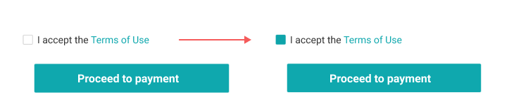
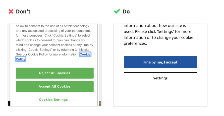
From first sight, it's not clear whether the consent is given because the selected checkbox doesn't show the checkmark that people are used to.
In an online pharmacy application, the selected tab in the bottom navigation bar looks like a floating action button. Users might expect a FAB to perform a key action, so making a tab look like a button could bring confusion.
Use appropriate controls
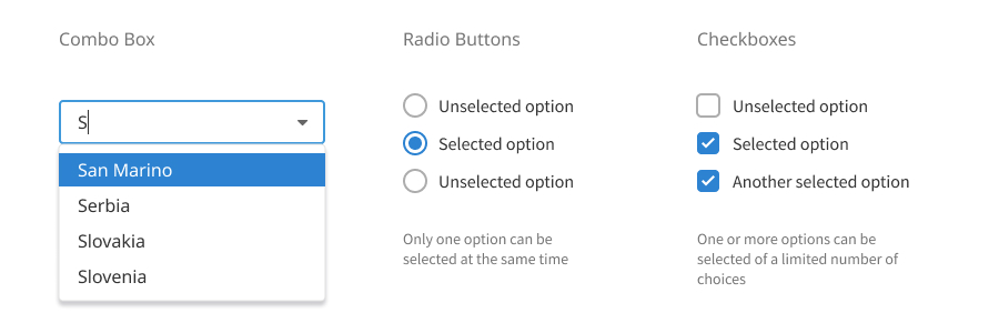
It is best to use controls based on their intended purpose; otherwise, users may miss some options that are available to them. The choice of controls may also affect usability, thus making task completion difficult. To illustrate, if a user needs to select a few options, checkboxes would be the best choice, while for a single selection, a group of radio buttons should be used. Employing radio buttons instead of checkboxes may make users think they can select a single option only.
The usability of controls deserves some time for further consideration, but there are some basic rules that can be memorised.
- Utilise radio buttons for a single choice of 2–4 options.
- To select one of 5–15 options, use dropdown menus.
- If the number of choices is bigger than 15, let a user search for an option by typing in the text field of a combo box.
- A group of checkboxes is suitable for selecting multiple options at once.
- A toggle is perfect for an action that applies immediately after switching it on, such as the airplane mode on your phone.
Generally, some research should be done before choosing a suitable control. It's always best to use native HTML controls because they work correctly for screen readers. However, if you want to develop a custom control, apply ARIA-labels.
Don't make links look like buttons
A link shouldn't look like a button and vice versa, since these elements provide different outcomes. A link opens a new page, while a button initiates an action, such as submitting a form or triggering a modal window. Replacing them with one another may bring confusion.
It is common on the web to see important links imitating buttons to attract a user's attention and call her to the desired action. While decorating such links as buttons is incorrect, leaving them without decoration at all may cause them to be missed by people. Luckily, some designers have found a solution. Alla Kholmatova, the author of Design Systems book, suggests adding call-to-action (CTA) links and buttons to a company's style guide. This way, CTA links would look prominent while acting as expected for a link.
To summarise, CTA links encourage a user to take an important action, such as going to a donation page, so they can look prominent. Regular links lead to other pages and don't have to be outstanding. It is enough to underline them, so people with low vision can differentiate them from the regular text.
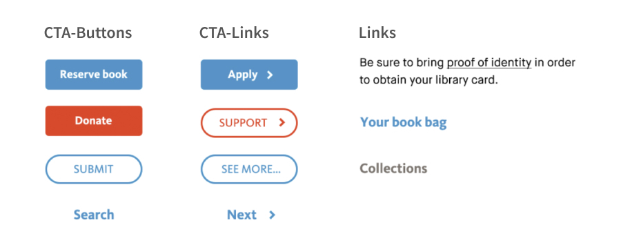
CTA links and CTA buttons from ‘Design Systems’ by Alla Kholmatova.
Facilitate decision making by using distinct buttons
In a button group, buttons that trigger actions of a different priority should have a distinct visual weight. A prominent primary button encourages a user to take an action. Conversely, a plain button doesn't demand a user's attention.
Buttons of a distinct visual weight reduce the mental burden on the user because they can spot a heavier-looking button more quickly, which leads to shorter decision-making time. People are used to noticeable buttons triggering important actions, so they don't have to read these button labels carefully. This helps to lower the interaction cost, or the efforts users invest in interacting with a webpage.
Buttons of similar visual weight make a choice difficult. People are used to a more prominent button triggering the important action. Visually distinct buttons eliminate the need to read labels carefully, thereby reducing interaction costs. Examples are from supervalu.ie and ikea.com.
Design for all states
Test design with different content
Designers usually create pretty layouts upon which headers, pictures and paragraphs fit perfectly. In real life, the size and placement of content can vary.
To make your design work for all content states, such as empty, maximal, minimal and optimal ones, it is best to place the following within it:
- Long and short titles and labels.
- Images of various sizes and ratios, or no images at all.
- Long and short paragraphs, or no text at all.
The layout should be checked whether it still looks fine in the maximal and minimal states. Designers should think of ways to hide extra content, such as truncating or collapsing long descriptions or adapting images.
When designing for the optimal state, we assume that a page looks a certain way most of the time. However, to make design adaptive, we should also cover other states when there is too much content or no content at all (empty state). Empty state coverage is important for eliminating confusion and preventing errors.
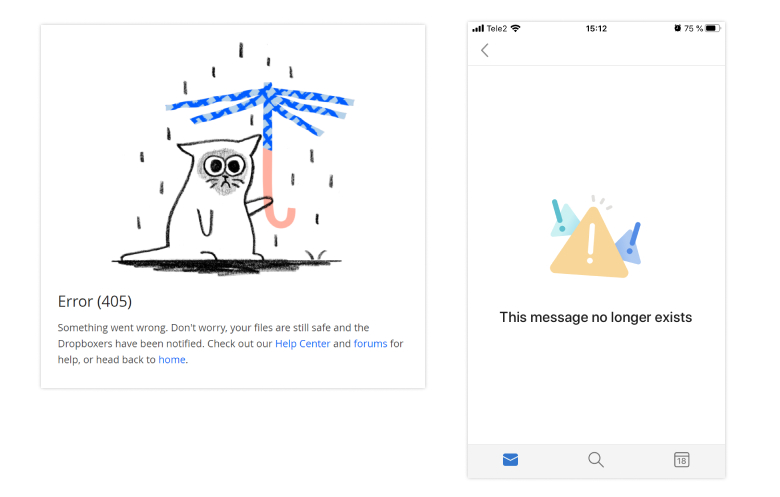
Examples of empty states from dropbox.com and Outlook app for iOS.
Give feedback through component states
The visual change in a component state provides valuable feedback to a user who interacts with it. Thus, it is important to show how the control looks on mouse hover, in a disabled state, when it is focused either by a mouse or through a keyboard, or when being selected.
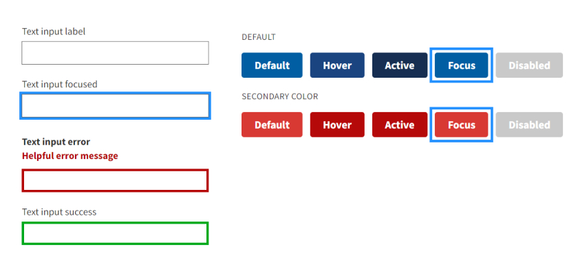
Examples of component states from U.S. Web Design System.
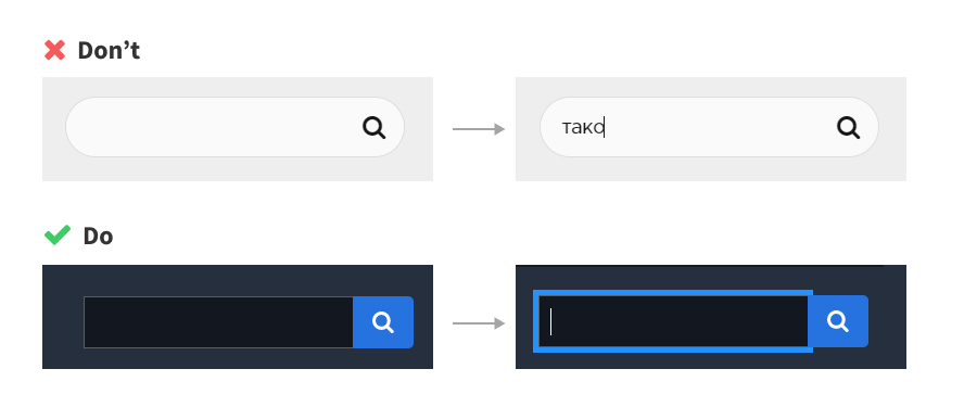
In the upper example, the change in the component state is too subtle. It's not immediately clear if the text field is focused, even though there's a blinking cursor. In the example below, the focus style is prominent. The thick blue border indicates that the focus is on the field.
Typeface and paragraph
Use fancy fonts in headers only
While working well in headers, unusual or decorative fonts ruin the readability of paragraphs. For long reading, choose a simple, legible typeface.
The fancy typeface on the left is better left for titles and headings.
Use a web-safe font to support low-resolution displays
Even though most people nowadays have modern devices, there are still plenty of users viewing your website on low-resolution displays. Web-safe fonts work well for such displays by preserving legibility.
When it comes to printing, every typeface looks good. The issues start when we view a font on a digital screen. Letters may not adjust with a pixel grid due to the bigger pixel size. To solve this problem, typography designers change font outlines to align them with a rasterised grid. This process is called font hinting.
Look at the example of hinting with the Georgia font from Erick Spiekermann's Stop Stealing Sheep & Find Out How Type Works. The outlines of the font are adjusted to provide a sharp look on a computer monitor.
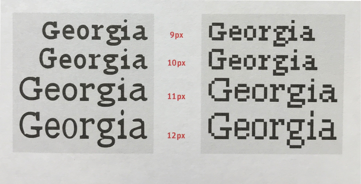
Example of font hinting from 'Stop Stealing Sheep & Find Out How Type Works'.
What web-fonts should be chosen?
Consider your brand characteristic, the legibility of the typeface and language support.
Source Sans Pro, Georgia, Segoe, Fira Sans, Proxima Sans and Lucida are the best web typefaces, according to Spiekermann. Lucida is especially good for extremely low-resolution screens.
The U.S. Web Design System that provides recommendations for creating accessible government sites suggests using Source Sans Pro, Open Sans, Merriweather, Helvetica, Verdana, Tahoma among other typefaces. Roboto & Noto font families support many foreign languages.
Limit the maximum width of a paragraph
The recommended length of a text line in a paragraph is 40–75 characters. It's difficult to follow lines that are too long. Likewise, lines that are too short make the eye skip from line to line too often, causing tiredness.
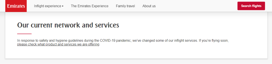
On the Emirates airline website, some text paragraphs consist of 142 characters, which is above the comfortable width. It may be difficult to follow the text line from the beginning to the end.
Choose leading depending on the paragraph width
Leading, or line height, is the area between the baselines of the nearby text lines. The term ‘leading’ refers back to times when physical lead tools were used to set the spacing between letter lines.
Choosing the line height size depends on the paragraph width. The longer the text lines, the bigger the vertical space between them needs to be, and vice versa. If you add a big line height to a short paragraph, it will cause a paragraph to fall apart and ruin the pace of reading.
The line height is usually between 1.2 and 1.8. According to WCAG level AA requirements for text spacings, the paragraph leading should be 1.5 or 150% of the font size. The headers are usually shorter than the paragraphs, so the leading in them should be smaller. Otherwise, they may visually drift apart into separate lines. The recommended line height for headings is from 1 to 1.2.
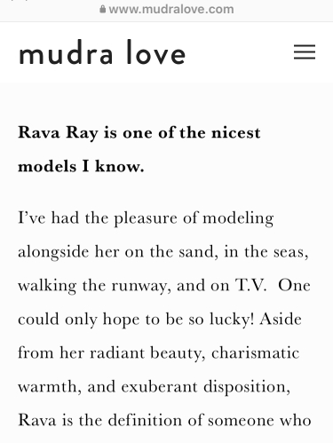
In this example, the line height is too big, and the lines are drifting apart. The space is not efficiently used because less text fits on the screen. Mudralove.com.
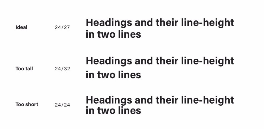
Illustration by Matej Latin.
Left-align text paragraphs
It's best to align text paragraphs on the left side. Centred or right-aligned text is challenging to read because every line begins in a new place, which makes it difficult for a reader to locate where they start.
It is much easier to read the left-aligned text. Icon made by Eucalyp from www.flaticon.com
Think about language localisation
If you're planning to adapt your website to different countries, it is best to ensure that it works with other types of languages as well.
For instance, words in German and Russian languages are longer than in English, so titles and labels may need more horizontal space. Some languages like Vietnamese have diacritic marks and additional upper elements added to letters, so these languages require more vertical space. For right-to-left languages such as Arabic or Hebrew, all the elements, including text labels, need to be mirrored.
In Russian, the short 'Post' turns into a very long word which affects the space left for the message itself.
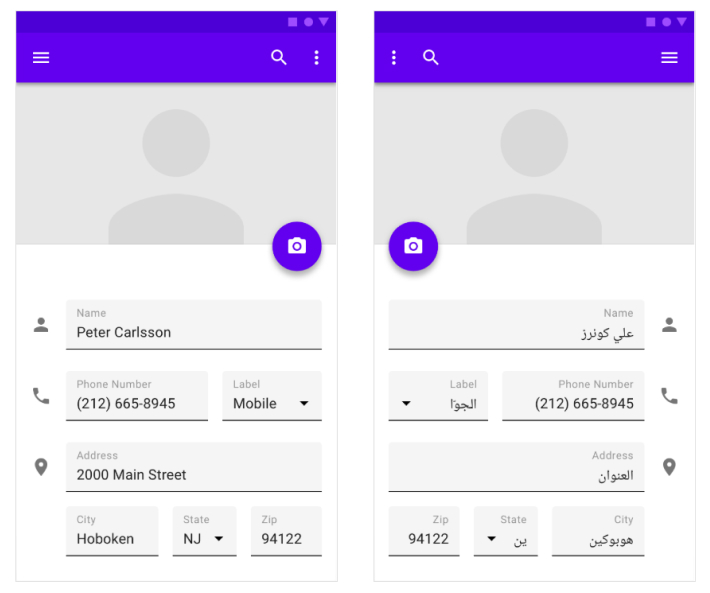
Layout mirroring on Material.io.
Colour and contrast
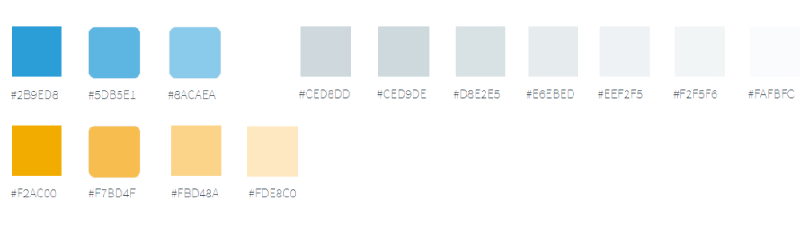
Reduce the number of colours
An excessive number of colours creates clutter and makes it difficult to maintain a design system. A primary colour should be selected for your main elements, such as important buttons, and a secondary colour should be used to accent less important elements, such as secondary buttons or background items.
Dark and light variants of each colour will help with designing component states or dark and light themes.
As a designer, you must decide whether you're going to decorate non-interactive elements with your primary colours, for example, to represent your brand.
Additional colours work for typography, surfaces, errors and so on.
Some systems, especially those that exist for a long time, turn out to have many shades of the same colour. In this example, the grey shades may be reduced to keep a component library neat.
Some systems choose to highlight headers and other elements with their primary colour. While this is a good way to attract attention, you should be careful because non-interactive elements may start looking like interactive ones, such as buttons.
Don't convey meaning by colour alone
To help colour-blind people perceive information, other tools should be used in addition to colours, such as written content, icons and other visual elements.
There are approximately 1 in 10–12 men and 1 in 150–200 women in the world who cannot differentiate colours to some extent.
People with protanopia and deuteranopia can't tell the difference between red and green. Tritanopia makes a person unable to distinguish blue and green, purple and red, and yellow and pink. Some people have complete colour blindness.
To test whether your design is still working for the colour-blind, it should be inspected in a monochromatic mode. There are various browser extensions that can do this, like Funkify or GrayScale the Web. Additional hints like patterns or text labels can reinforce communication.
The error message paired with the warning icon helps a user recognise an incorrect input.
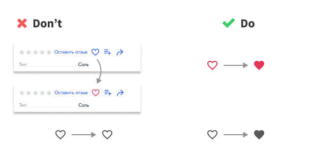
Adding a product to favourites changes the icon outline colour. This behaviour violates accessibility requirements: the feedback shouldn't be delivered by colour alone. In this case, it is better to add a fill to the icon. Converting an image to monochrome shows how much better the change in state between the outlined and the filled icon is.
Use colours to reinforce meaning
Depending on cultural specifics, colours have various connotations. In western countries, the green colour often marks a successfully completed action or indicates the stability of a system. The red colour usually shows an error or a destructive action. If the red colour is a part of your company identity, you may want to think about using an alternative colour for highlighting errors.
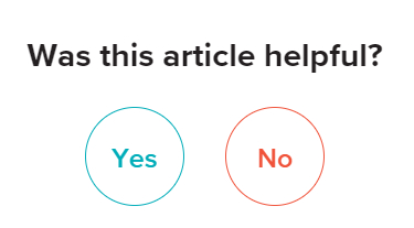
The action with a negative meaning is highlighted in red on healthline.com.
Since the red colour is a part of the brand, orange fits better for showing a negative feedback banner. Example is from material.io.
Use enough contrast for non-decorative graphic elements
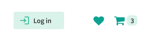
If a graphic element conveys meaning, it must have enough contrast to its background for people with low vision to see it. For instance, an icon paired with a label is decorative because the label itself carries meaning. Conversely, a standalone icon that is essential for understanding the functionality needs to be legible for people aiming to click it.
Essential graphical objects must have a contrast ratio of at least 3:1 against the adjacent colour.
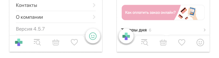
The icon on the left isn't essential for understanding what a button does. Conversely, the icons on the right work as links to favourite products and the cart.
Pay attention to text contrast
According to WCAG 2.1, the contrast ratio for text must be at least:
- 3:1 for normal observers (level A);
- 4.5:1 for users with moderate vision loss (level AA);
- 7:1 for people with a severe loss in contrast and sensitivity who don't use assistive technology such as screen readers.
You can check the contrast on Webaim.org.
However, you should avoid using pure black text on a pure white background. Such a high contrast may cause difficulties for people with Irlen syndrome. For regular observers, this level of contrast may be uncomfortable as well.
Figma uses the pure black font; it has a high contrast ratio, which is good, but in some cases, it may be challenging for people with Irlen syndrome.
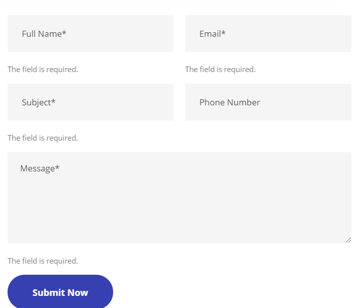
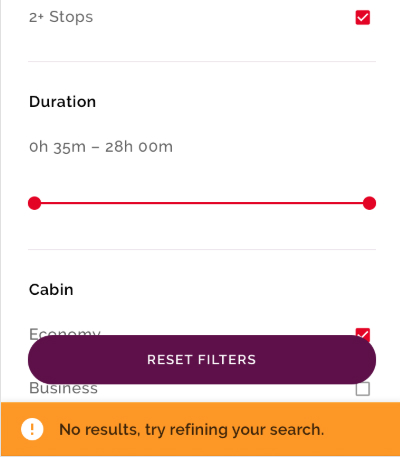
In this form, the contrast ratio of validation messages isn't sufficient for WCAG level AA requirements.
To sum up
I hope these tips will help you in your daily work. To summarise:
- Design with a user in mind.
- Be consistent and predictable.
- Write in plain language.
- Embrace the needs of special users.
Good luck in creating useful and usable products!