A segmented control is a linear set of two or more segments, each of which functions as a mutually exclusive button. SwiftUI has a segmented control implemented as a Picker with the SegmentedPickerStyle. However, one may want to further customise the Picker appearance. Unfortunately, PickerStyle it not yet intended to be subclassed to fine-tune its appearance. Nevertheless, it is not hard to implement a custom view like this in SwiftUI, and there are number of guides available. However, most of these examples provide an API that doesn’t resemble the built-in SwiftUI approach.
Our goal today is to create a Segmented Control that accepts segments not as an array, but as views provided by the ViewBuilder. This is the same method that the standard Picker employs.
SwiftUI Picker interface:
Picker("Mode", selection: $mode) {
    Text("Manual").tag(Mode.manual)
    Text("Auto").tag(Mode.auto)
}
.labelsHidden()
.pickerStyle(.segmented)
Public interface
Let’s start by looking into the Picker to find some inspiration.
public struct Picker<Label, SelectionValue, Content> : View where
Label : View, SelectionValue : Hashable, Content : View
We’re not too interested in having a label, but we would like to have the SelectionValue and the Content as well. This is a good starting point. Next, let’s check one of the initialisers.
public init(_ titleKey: LocalizedStringKey, selection:
Binding<SelectionValue>, @ViewBuilder content: () -> Content)
Again, we don’t need a label, but we’ll keep everything else. At this point, we are ready to implement the first draft of the CustomSegmentedControl.
public struct CustomSegmentedControl<SelectionValue, Content>: View
where SelectionValue: Hashable, Content: View {
    @Binding public var selection: SelectionValue
    private let content: Content    public init(selection: Binding<SelectionValue>,
                @ViewBuilder content: () -> Content) {
        self._selection = selection
        self.content = content()
    }

    public var body: some View {
        content
    }
}
Let’s put this into the container, add some text views inside, and see how it renders in the Playground.
struct RootView: View {
    enum LayoutMode {
        case years
        case months
        case days
    }

    @State var mode: LayoutMode = .days

    var body: some View {
        VStack {
            CustomSegmentedControl(selection: $mode) {
                Text("Years")
                Text("Months")
                Text("Days")
            }
            .frame(width: 300)
        }
        .frame(width: 400, height: 400, alignment: .center)
    }
}
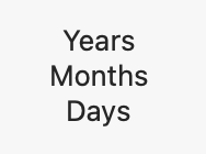
All the segments are there, although this is far from what we need yet.
Basic layout
In our case, the desired layout is an HStack. Let’s wrap the content into one and add some styling. We will not make the style externally customisable for the sake of readability. This can be done as an exercise based on the concrete requirements.
public var body: some View {
    HStack(spacing: 0) {
        content
    }
    .padding(1)
    .textCase(.uppercase)
    .background(RoundedRectangle(cornerRadius: 5).fill(.gray))
    .frame(idealHeight: 16)
}
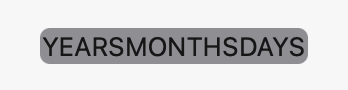
Now, the outcome much more closely resembles the desired result. However, we don’t yet have any selection.
Passing the selection state
The selection state management approach may not appear clear. We want to achieve the same API as SwiftUI has, so passing a variable directly to the segment initialiser is not an option.
What other options do we have? Let’s analyse the data flow first.
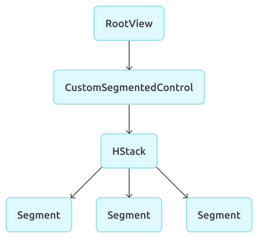
We have a RootView where we configure both the CustomSegmentedControl and the segments. RootView owns the state. CustomSegmentedControl doesn’t initialise segments. Instead, it accepts them as abstract views. Therefore, we need to pass the selection state from the CustomSegmentedControl to the segments through the HStack. Now, the problem should be more familiar. That’s what Environment is for!
To pass something using Environment, we need a key and an extension on EnvironmentValues.
private struct SelectedSegmentTagKey: EnvironmentKey {
    static var defaultValue: Any?
}private extension EnvironmentValues {
    var selectedSegmentTag: Any? {
        get { self[SelectedSegmentTagKey.self] }
        set { self[SelectedSegmentTagKey.self] = newValue }
    }
}
Let’s set the environment variable in the CustomSegmentedControl view now.
@Binding public var selection: SelectionValuepublic var body: some View {
    HStack(spacing: 0) {
        content
    }
    .clipShape(RoundedRectangle(cornerRadius: 4))
    .padding(1)
    .textCase(.uppercase)
    .background(RoundedRectangle(cornerRadius: 5).fill(.gray))
    .frame(idealHeight: 16)
    .environment(\.selectedSegmentTag, $selection)
}
Highlighting the selected segment
We have the selection in the environment now, but it’s not accessed anywhere. It’s now time to fix this. There is no custom view representing the segment yet. At this point, it’s possible to wrap the Text view into the segment view in a custom tag modifier. Let’s start with this step.
public extension View {
    func segmentedControlItemTag<SelectionValue: Hashable>(_ tag: SelectionValue) -> some View {
        return SegmentedControlItemContainer(tag: tag,
                                             content: self)
    }
}
The custom segment interface appears to be clearer. Now, we need a generic SelectionValue as well as the content view (which is Text in our case). Inside that view, we’ll read the selected value and compare it with the segment value to highlight the segment if needed.
private struct SegmentedControlItemContainer<SelectionValue, Content>: View
where SelectionValue: Hashable, Content: View {
    @Environment(\.selectedSegmentTag) var selectedSegmentTag
    let tag: SelectionValue
    let content: Content    @ViewBuilder var body: some View {
        content
            .frame(maxWidth: .infinity)
            .contentShape(Rectangle())
            .foregroundColor(isSelected ? .black : .white.opacity(0.8))
            .background(isSelected ? background : nil)
            .onTapGesture {
                select()
            }
            .disabled(isSelected)
    }    private var background: some View {
        RoundedRectangle(cornerRadius: 4)
            .fill(.white)
            .padding(.horizontal, -4)
    }    private var isSelected: Bool {
        let selectedTag = (selectedSegmentTag as? Binding<SelectionValue>)?.wrappedValue
        return tag == selectedTag
    }    private func select() {
        if let binding = selectedSegmentTag as? Binding<SelectionValue> {
            binding.wrappedValue = tag
        }
    }
}
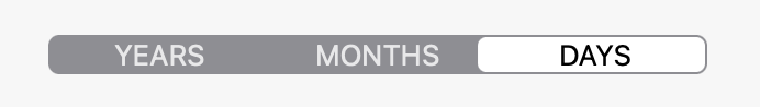
It’s time to update the preview and see what we get.
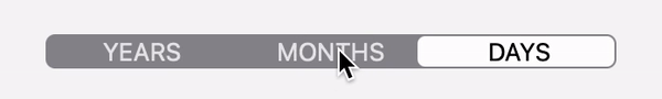
var body: some View {
    VStack {
        CustomSegmentedControl(selection: $mode) {
           Text("Years").segmentedControlItemTag(LayoutMode.years)
           Text("Months").segmentedControlItemTag(LayoutMode.months)
           Text("Days").segmentedControlItemTag(LayoutMode.days)
        }
        .frame(width: 300)
    }
    .frame(width: 400, height: 400, alignment: .center)
}

This looks exactly like the initial goal!
However, in this case, it’s just a static image.
Animation
One most likely would prefer that the selection changes be animated. Even though the fade in/out animation is as trivial as adding withAnimation into the proper place, animating the selected segment background movement between the segments requires some additional work.
There is the matchedGeometryEffect that serves exactly this purpose. However, it needs a shared namespace. If we introduce it, we’ll discover that we have the same problem as before. The goal is to share the namespace between segments, but the RootView doesn’t need to know anything about that namespace when it creates the segments. Therefore, we should use the Environment once again to share the namespace.
private struct SegmentedControlNamespaceKey: EnvironmentKey {
    static var defaultValue: Namespace.ID?
}private extension EnvironmentValues {
    var segmentedControlNamespace: Namespace.ID? {
        get { self[SegmentedControlNamespaceKey.self] }
        set { self[SegmentedControlNamespaceKey.self] = newValue }
    }
}
The container:
public var body: some View {
    HStack(spacing: 0) {
        content
    }
    .clipShape(RoundedRectangle(cornerRadius: 4))
    .padding(1)
    .textCase(.uppercase)
    .background(RoundedRectangle(cornerRadius: 5).fill(.gray))
    .frame(idealHeight: 16)
    .environment(\.selectedSegmentTag, $selection)
    .environment(\.segmentedControlNamespace, namespace)
}
The segment:
@Environment(\.segmentedControlNamespace) var segmentedControlNamespace
@Namespace var namespace@ViewBuilder var body: some View {
    content
        .frame(maxWidth: .infinity)
        .contentShape(Rectangle())
        .foregroundColor(isSelected ? .black : .white.opacity(0.8))
        .background(isSelected ? background : nil)
        .onTapGesture {
            select()
        }
        .disabled(isSelected)
}private var background: some View {
    RoundedRectangle(cornerRadius: 4)
        .fill(.white)
        .padding(.horizontal, -4)
        .matchedGeometryEffect(id: "selection",
in: segmentedControlNamespace ?? namespace)
}private func select() {
    withAnimation(.easeInOut(duration: 0.2)) {
        if let binding = selectedSegmentTag as? Binding<SelectionValue> {
            binding.wrappedValue = tag
        }
    }
}
This looks perfect now!
Conclusion
The technique consisting of a combination of custom modifiers and Environment can solve several tasks that appear to be non-trivial at first glance.
It’s a pity that we don’t have access to the entities that Apple uses extensively in SwiftUI, like tag and presentationMode. I’m sure they will be more extendible in the future. Nevertheless, even without them, it’s possible to create custom views that are consistent (to some extent) with SwiftUI design patterns.
Have a good SwiftUI experience!